Fiserv: United Money Movement
2021
Overview
Fiserv powers financial infrastructure for thousands of banks and credit unions — but their money movement products (Zelle, Bill Pay, TransferNow) lived as separate, disconnected experiences inside banking apps. Users had to learn and navigate each one independently, essentially thinking the way the system was built rather than how they naturally move money.
Roles & Responsibilities
As Lead Designer, I focused on bringing sending, requesting, and bill pay into one unified system. I led stakeholder interviews, competitive research, flow design, and validation, translating fragmented product logic into a coherent experience and delivering a scalable toolkit for Fiserv's team to build from after handoff.
Deliverables
Produced a mobile prototype aligned with technicians’ Apple devices, with a visually refined experience that resonated with the client’s brand and usability needs.
Challenge
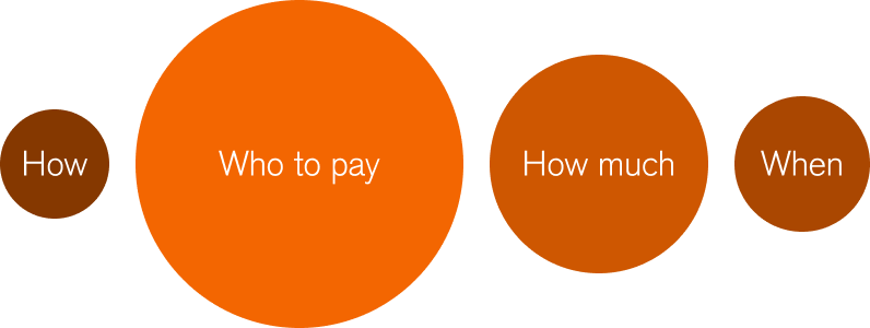
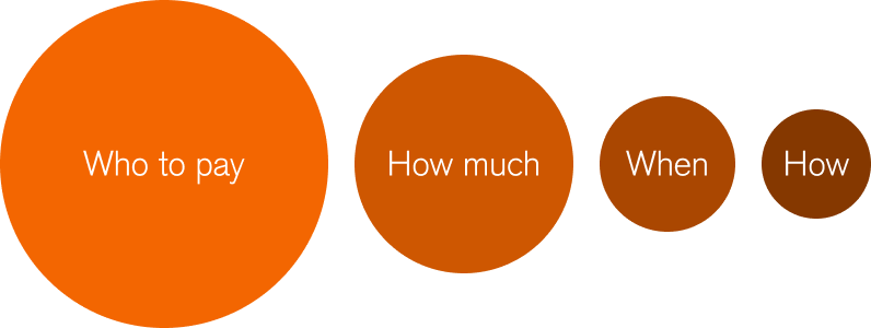
Banks were losing younger users to fintech competitors. The ask was to help FIs close that gap with a differentiated payments experience built for a generation that expects fintech-level quality from their bank. The real problem wasn't the products — it was the structure. Banks designed around payment methods. Users care about who they're paying, how much, and when.
Research
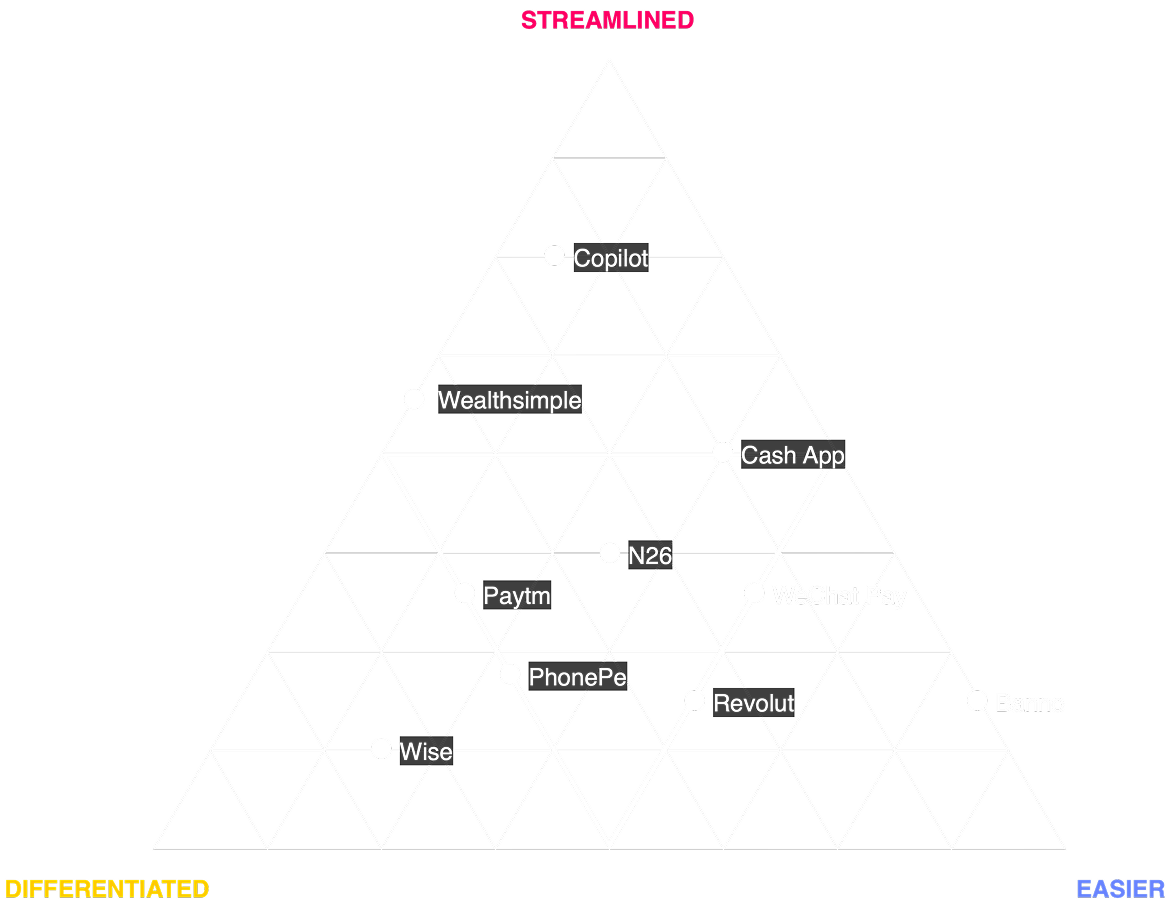
Stakeholder interviews and user conversations revealed one consistent pattern — people don't think in payment types. They think about a person, a biller, a goal. Competitive analysis of Revolut, Cash App, and N26 reinforced that starting with the person, not the method, is what makes an experience feel direct and intuitive.
Design Principles
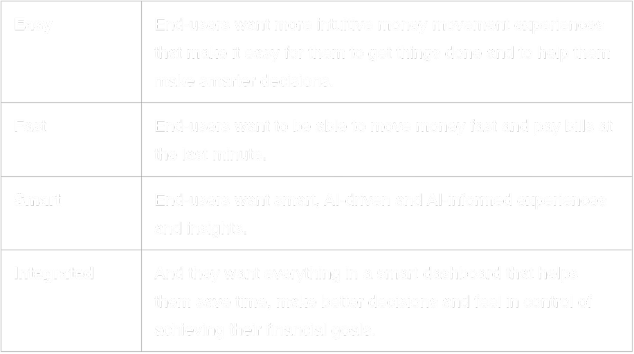
Four principles emerged as strategic filters across every design decision.
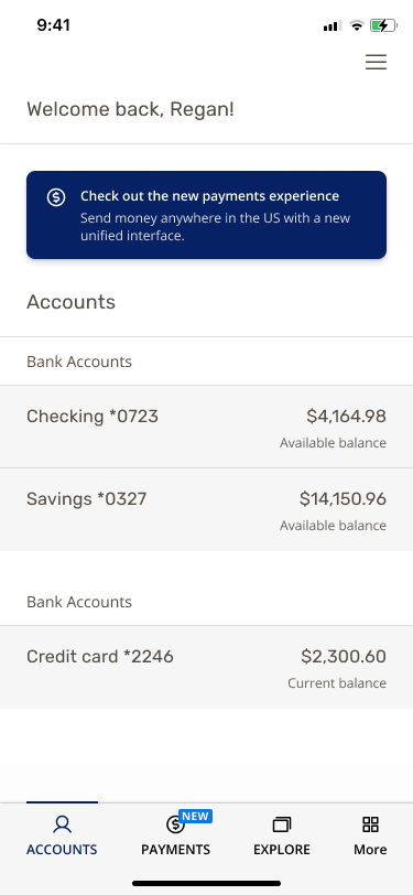
Where We Are Today
Where We Want To Go
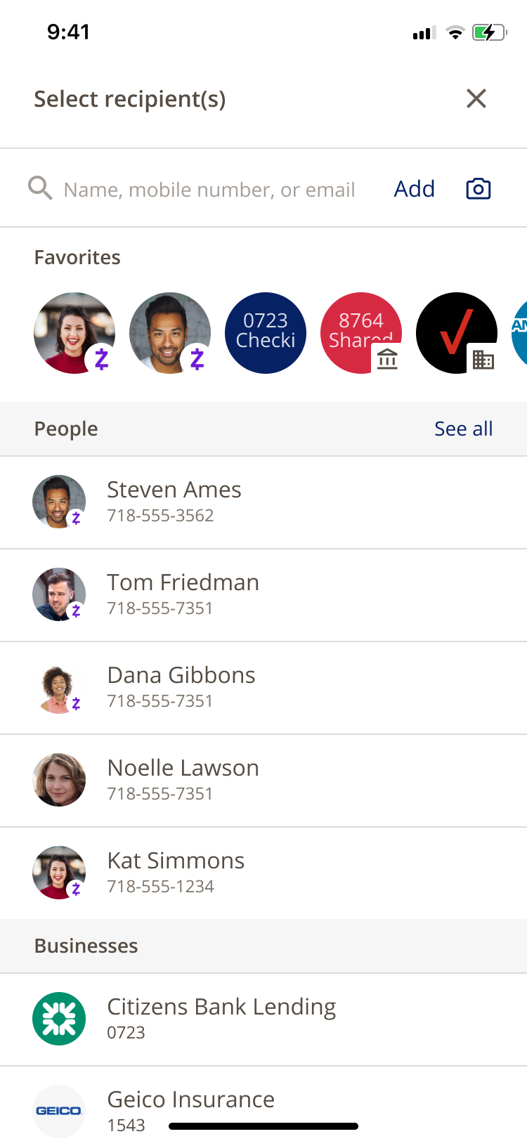
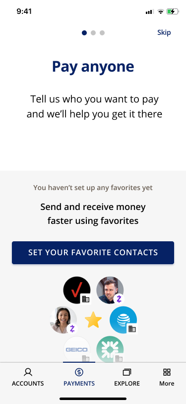
Create a more natural flow
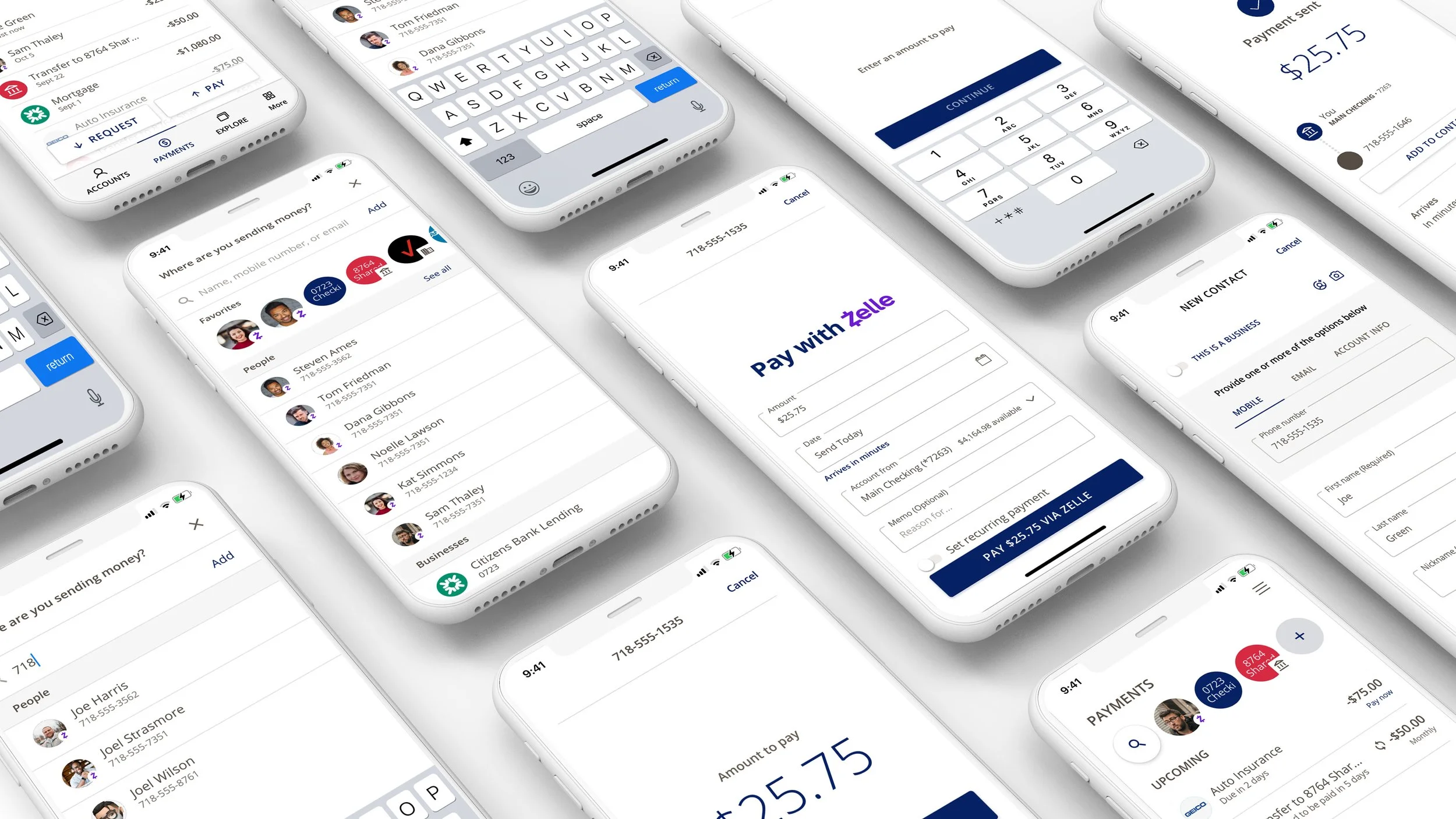
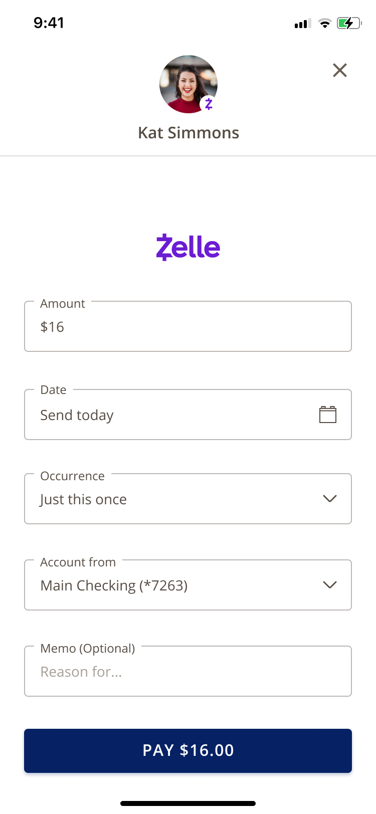
We shifted the sequence from leading with how to leading with who. Who, how much, when and the system handles the rest. Zelle, Bill Pay, and transfers still power the experience in the background. The user never sees the seams.
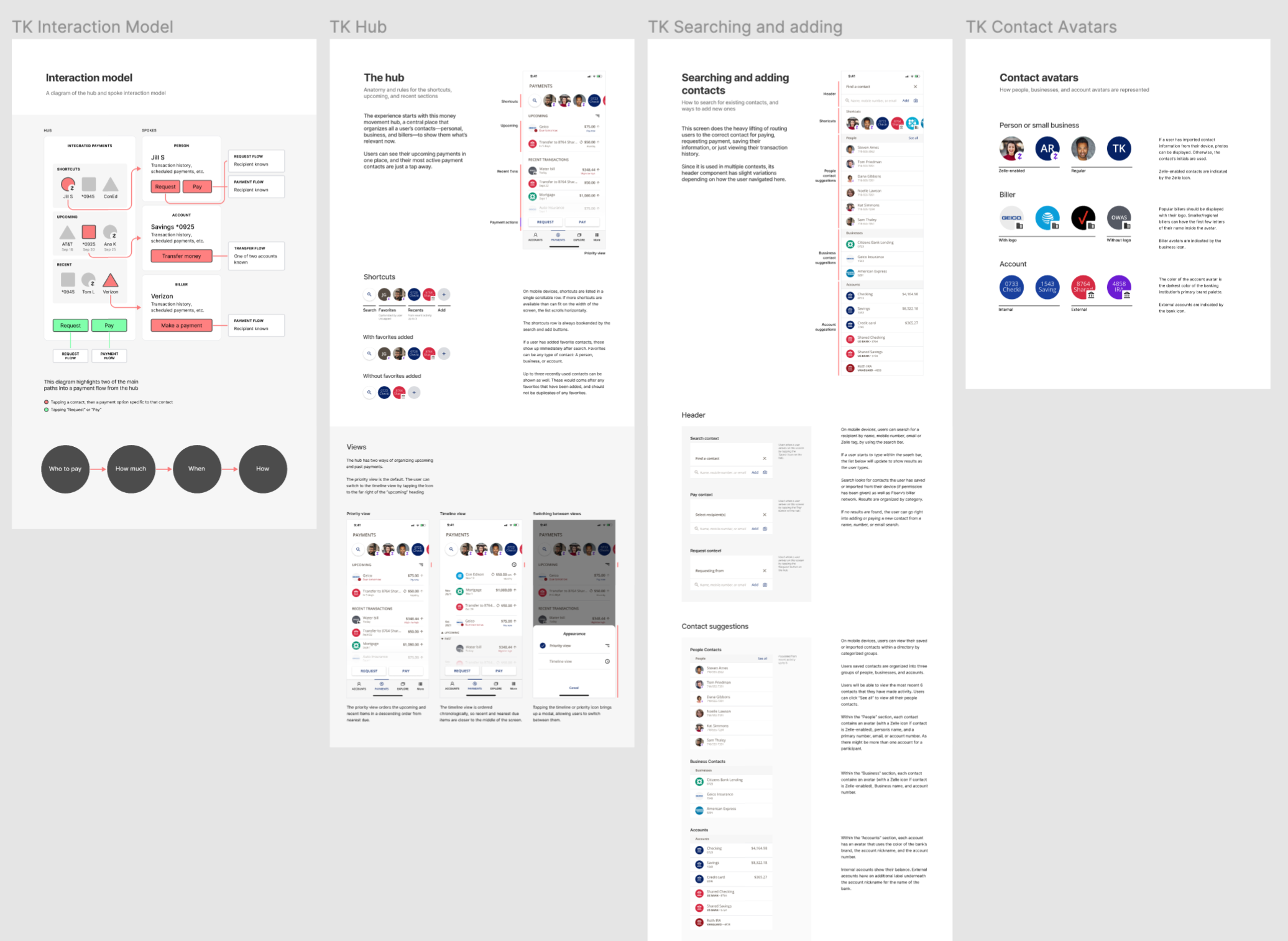
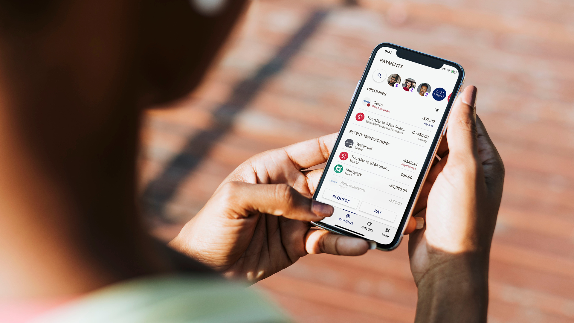
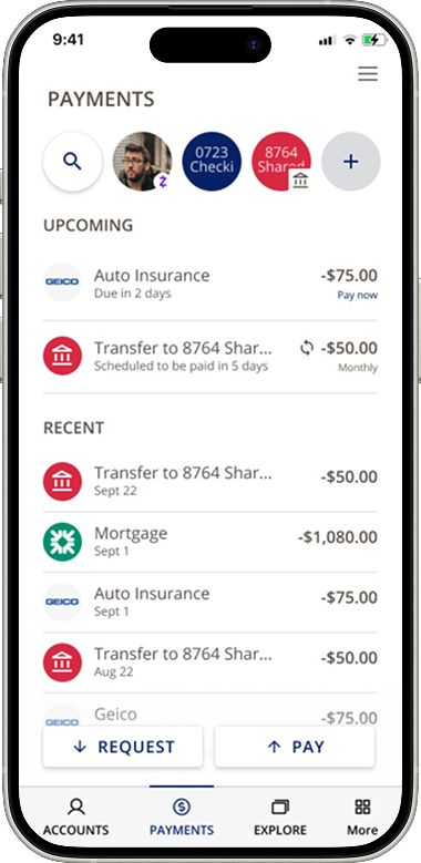
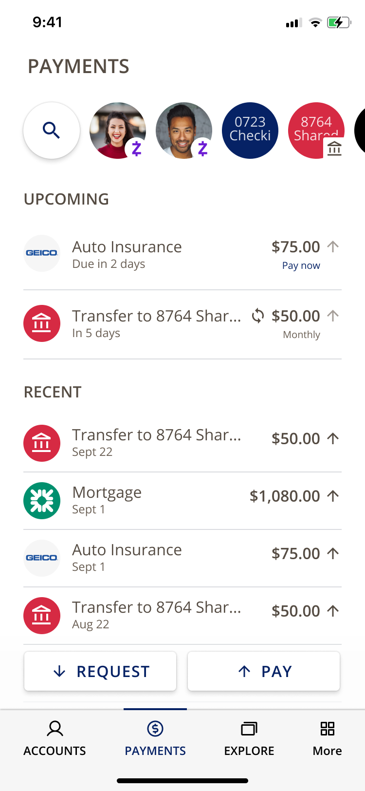
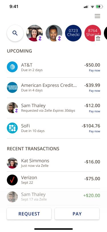
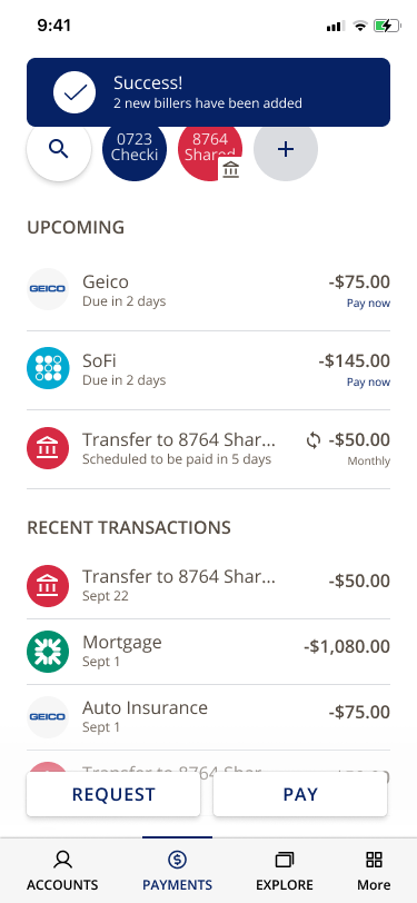
The Hub
The Hub became the single entry point into the experience, organized around people, accounts, and activity rather than a list of tools. Users tap into a contact, see what needs attention, and initiate a payment. The system routes it from there.
"It's very easy, it's very clean. I love the icons. It's very visually appealing."
— Susan G., Late 50s
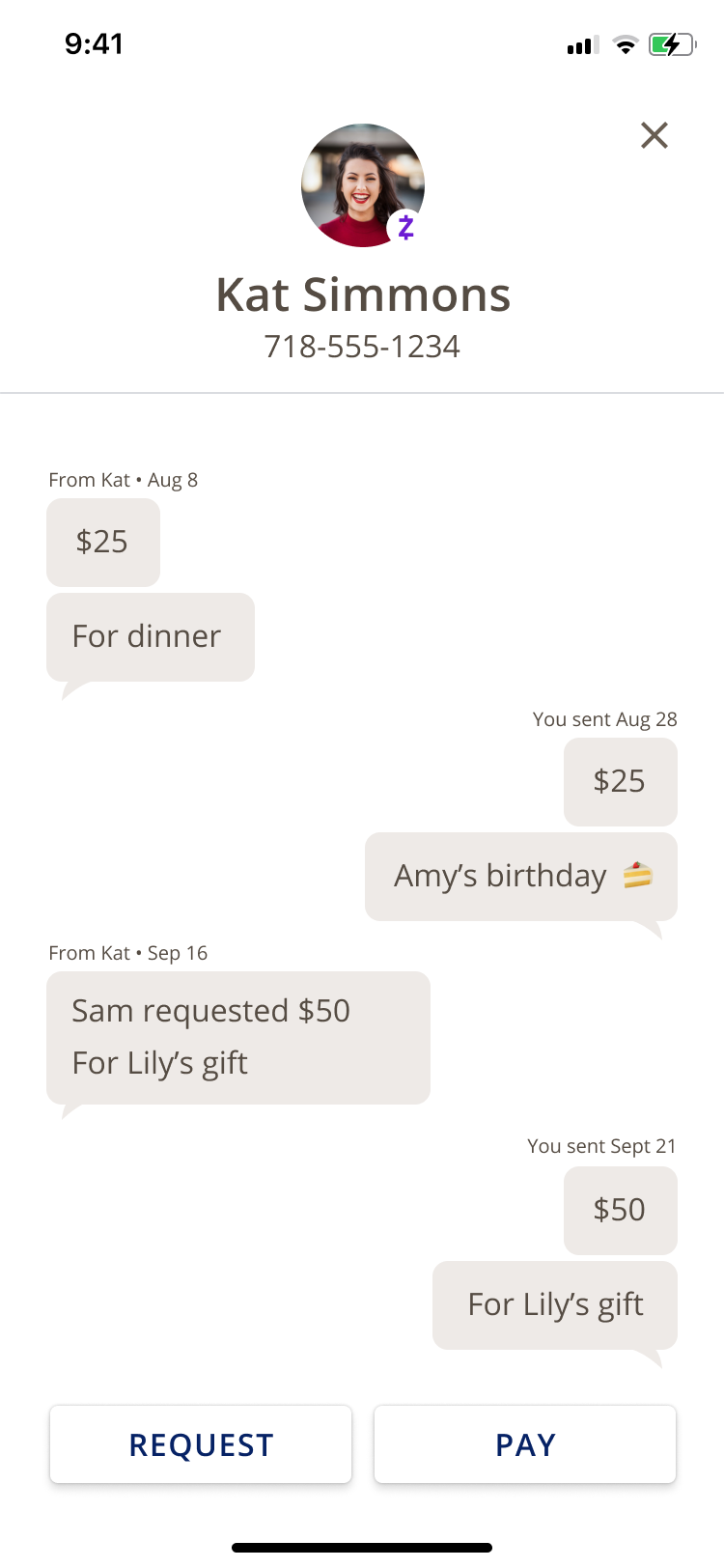
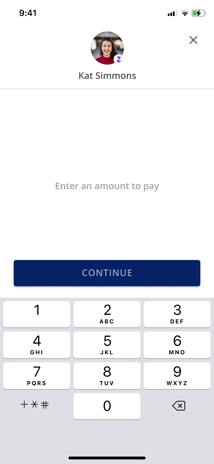
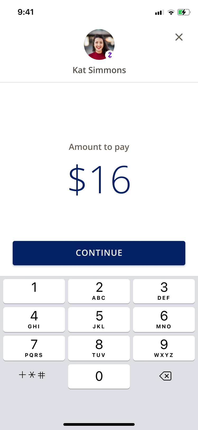
Paying a person flow
The Hub became the single entry point into the experience, organized around people, accounts, and activity rather than a list of tools. Users tap into a contact, see what needs attention, and initiate a payment. The system routes it from there.
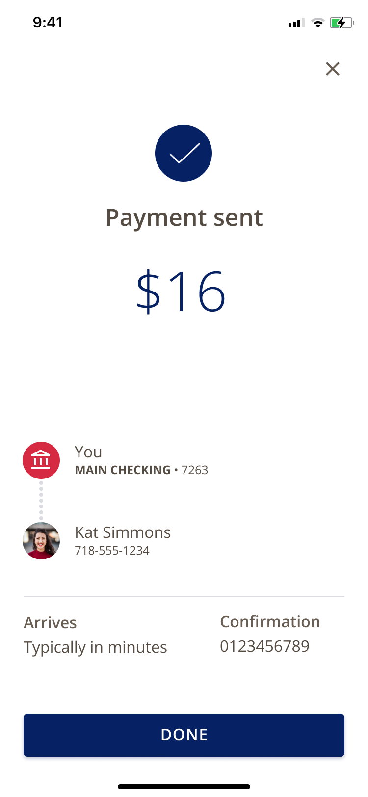
"I would like one more confirmation before. If you're making a big decision, it should give you a pop up confirmation."
— Kian P., Age 14
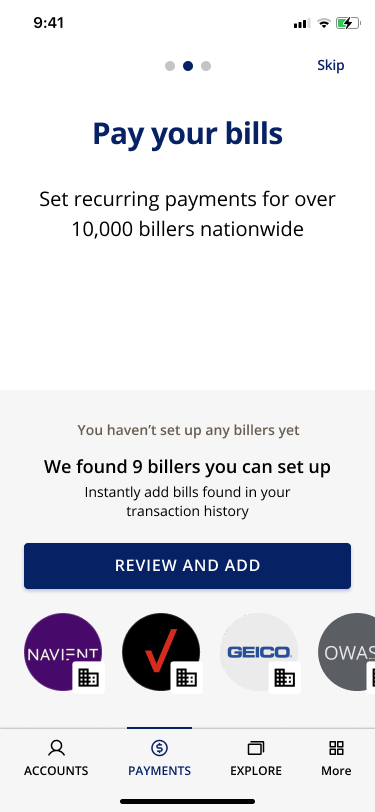
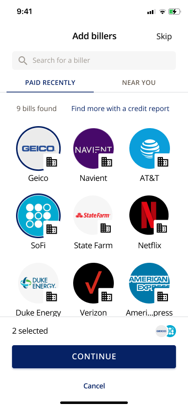
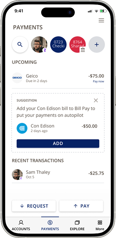
Bill Pay Onboarding
The system pulls from transaction history to surface billers users have already interacted with. Onboarding becomes about confirming what the system already knows, not building from scratch.
"Things like budgeting support would be ideal, because I can know where my money is going. Can I start to be more aware and prepare for the future?"
— Patrick, Validation participant
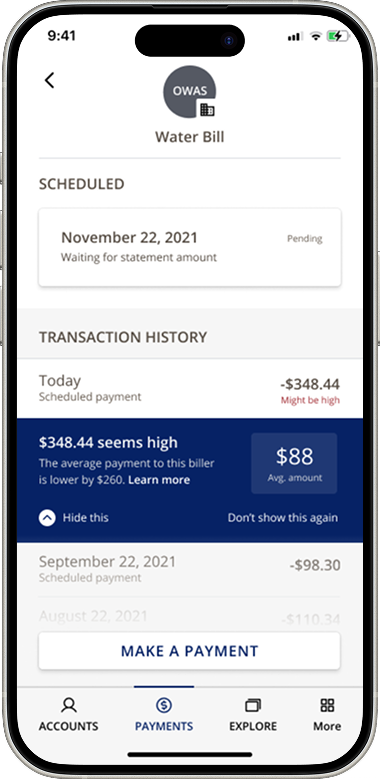
Smart Suggestions
A lightweight suggestion layer surfaces relevant information at the right moment an unusual bill amount, a biller worth automating. The guiding principle was restraint. Useful, never noise.
Deliverables
Produced a unified mobile experience including a payments hub, money movement flows, and bill pay onboarding, supported by a documented toolkit built for Fiserv's team to implement and scale after handoff.
Outcomes
The result was a more unified way to move money one that felt like a single experience instead of three products stitched together. The biggest impact wasn't adding features. It was getting the structure right.